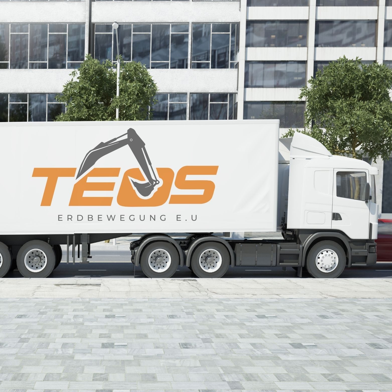
Refreshing a family-run Vienna excavation brand without losing what customers already knew.
Project overview
We refreshed TEOS’s identity without losing what customers already recognised, and gave the business one consistent look across print, web and social for the first time.
- ILLUSTRATOR
- WORDPRESS
- CANVA · META BUSINESS SUITE
- VIDEO & PHOTO GRADING
TEOS had a logo but almost nothing around it: no business cards, no website and practically no online presence. The existing emblem was heavy and boxy, a large orange block with a chunky bucket stacked over the name, which made it hard to use small and dated next to newer competitors. The brief was clear: refresh it, don’t replace it. On top of that, every visual came from the site team itself: phone shots taken on active job sites, in harsh midday light, with cluttered backgrounds.
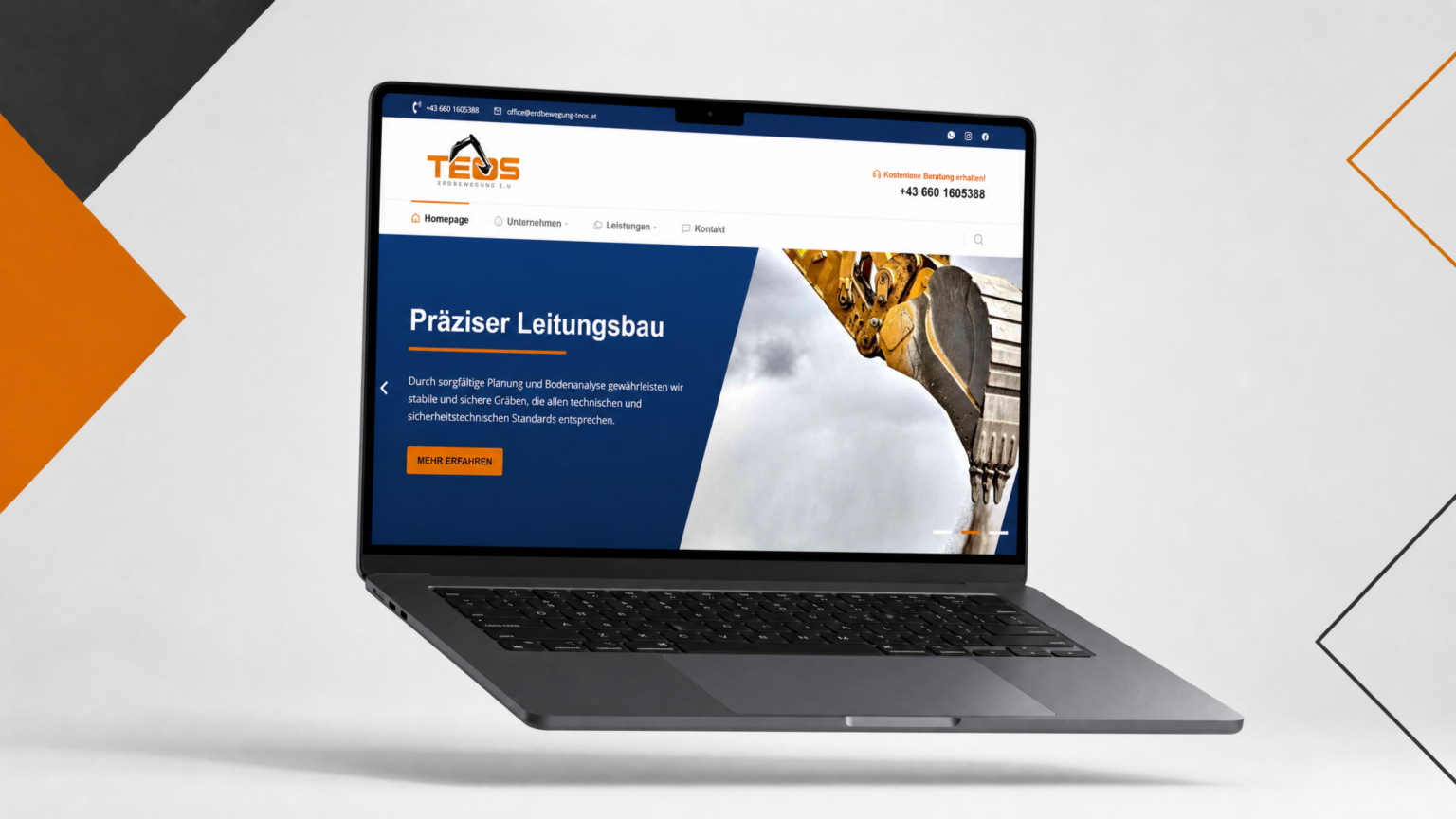
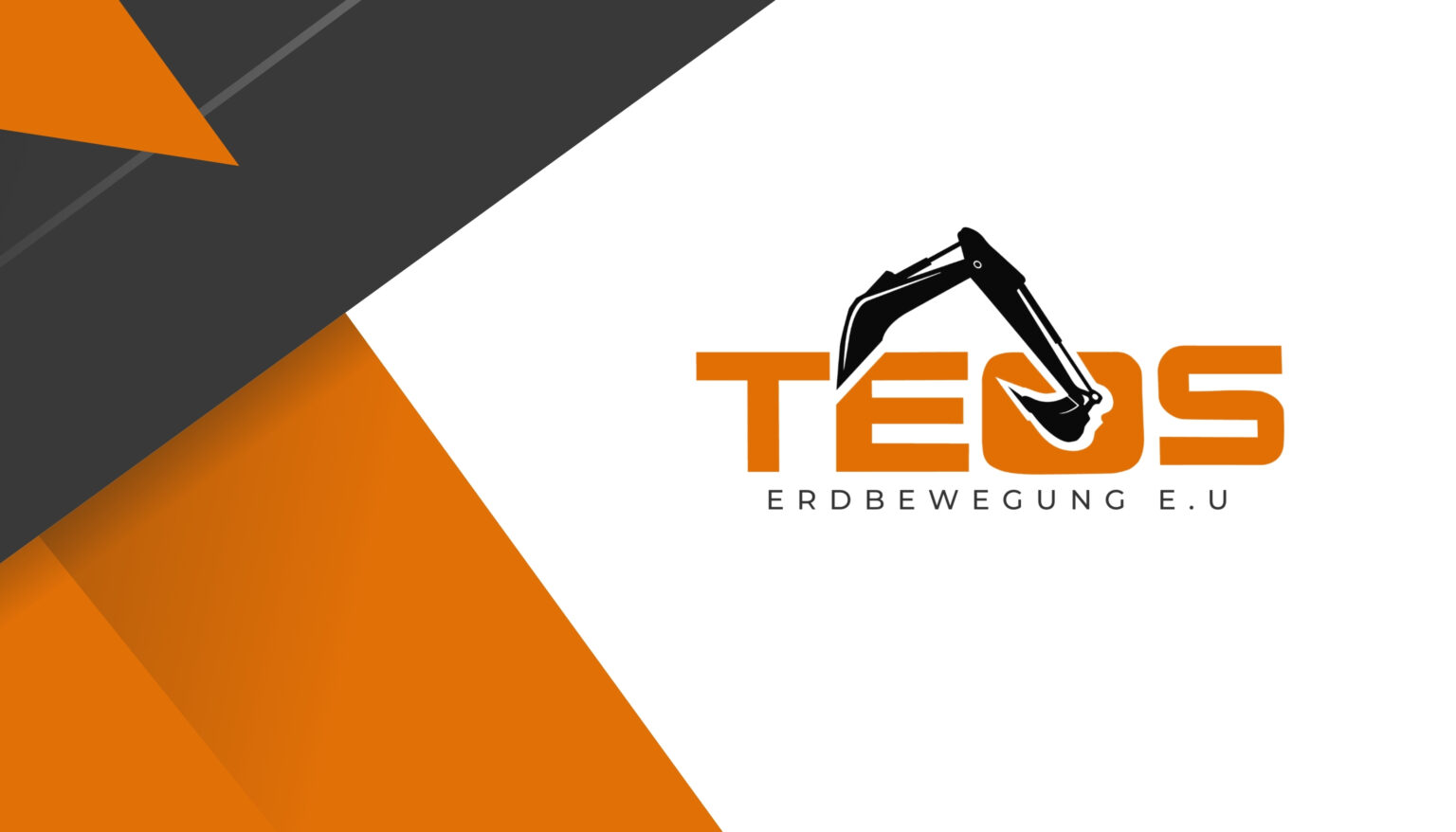
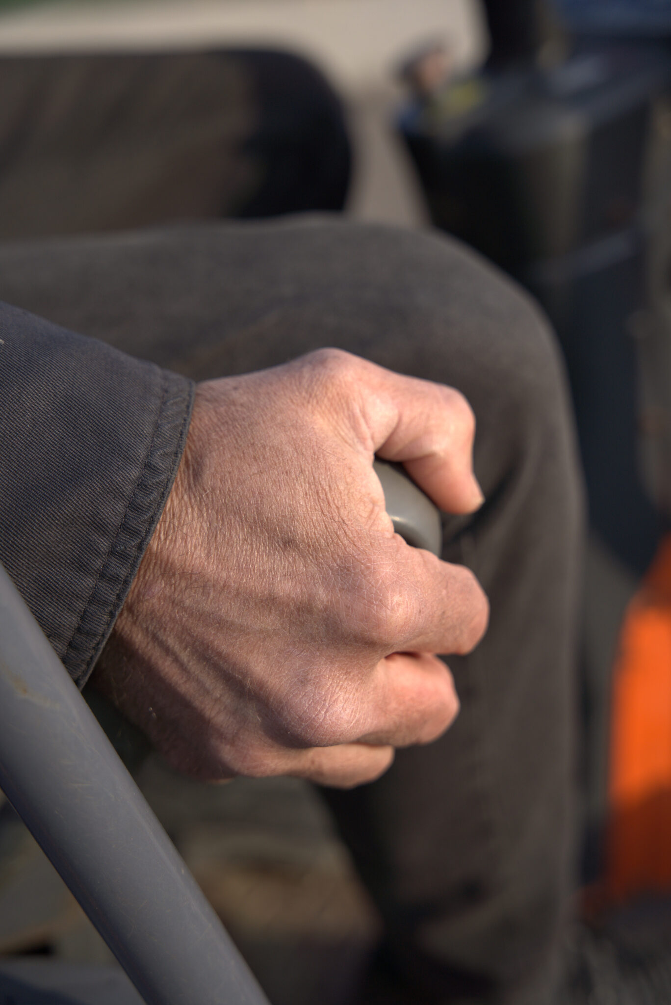
We kept the orange and black that customers already associated with TEOS, and changed everything around them. Instead of an icon stacked above the text, the excavator arm now grows out of the lettering and scoops into the “O”, so the logo works as one compact unit that reads as earthmoving at a glance. The tagline moved from a solid orange bar to light, widely spaced lettering, signalling an established, registered company. For photography, we selected the strongest phone frames, cropped them for focus and graded them into one consistent look (warm earth tones, clean skies, controlled highlights), and carried the same grade into the Reels.
What we deliveredA refreshed logo, business cards and a price list. A responsive WordPress site with dedicated service pages for garden and pool excavation, trenching, equipment rental and demolition, plus clear calls to action. Branded templates for Instagram and Facebook posts and stories, Reels, and a homepage header video cut from raw on-site clips.
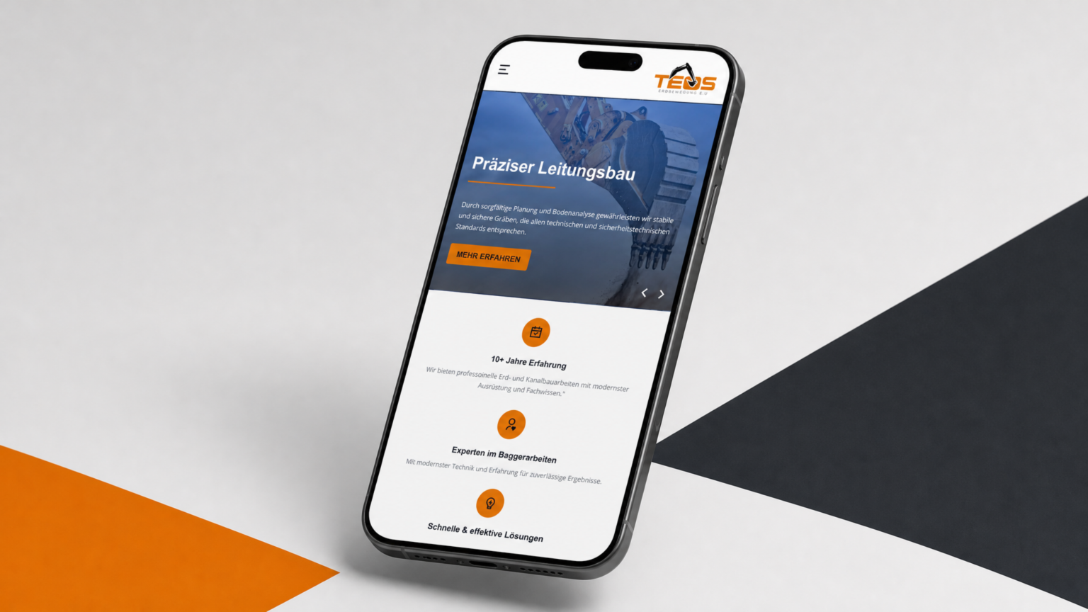
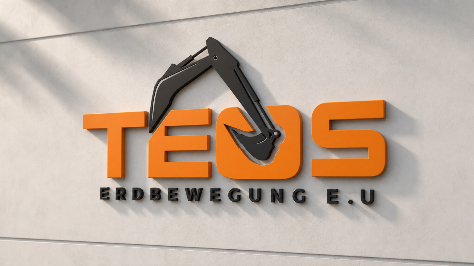
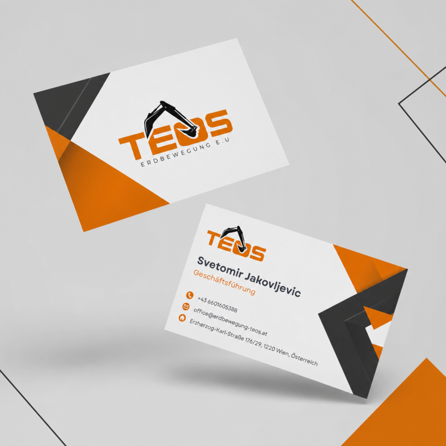
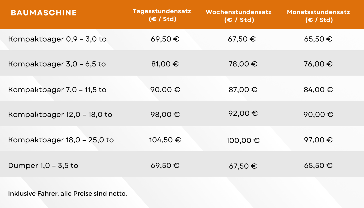
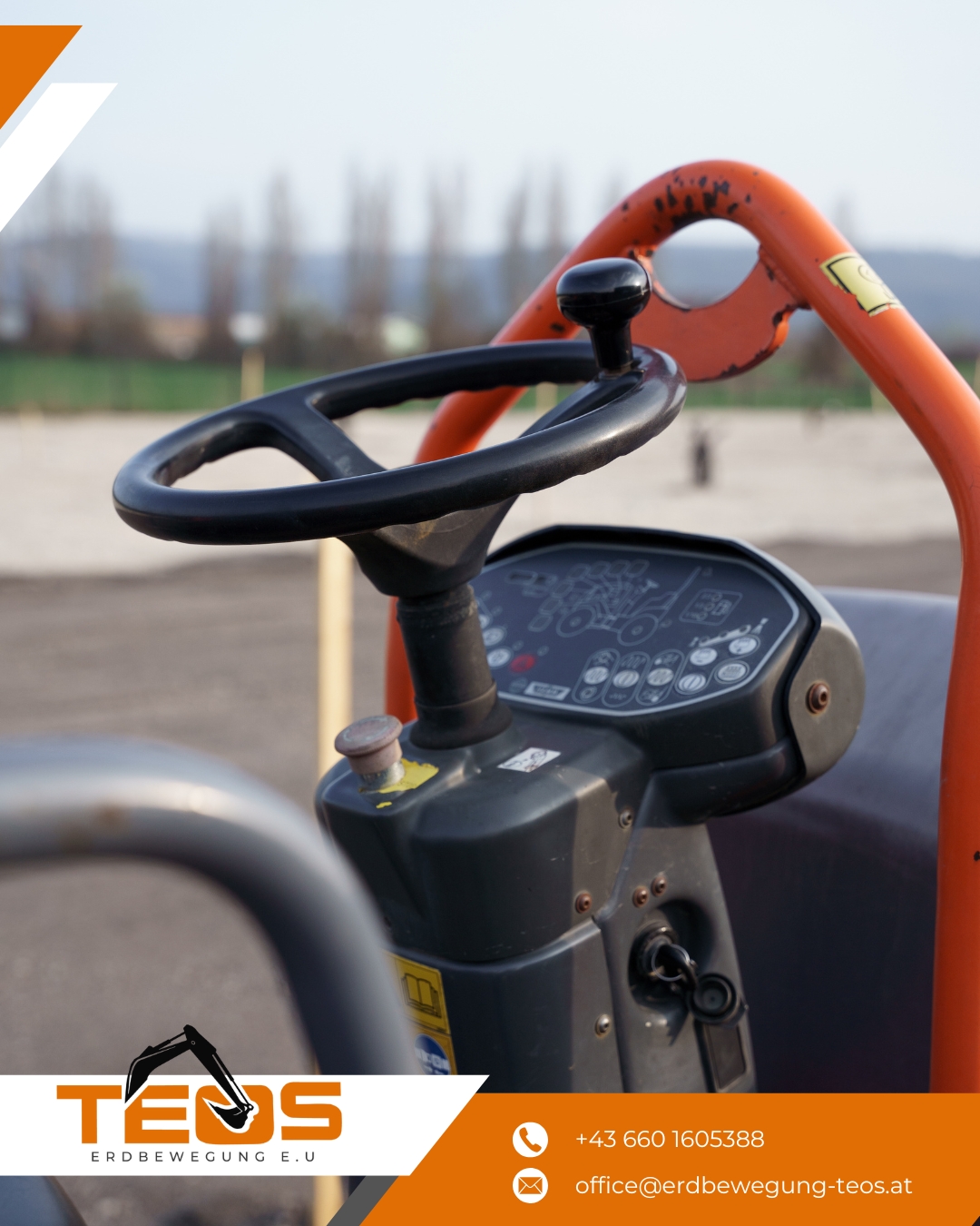
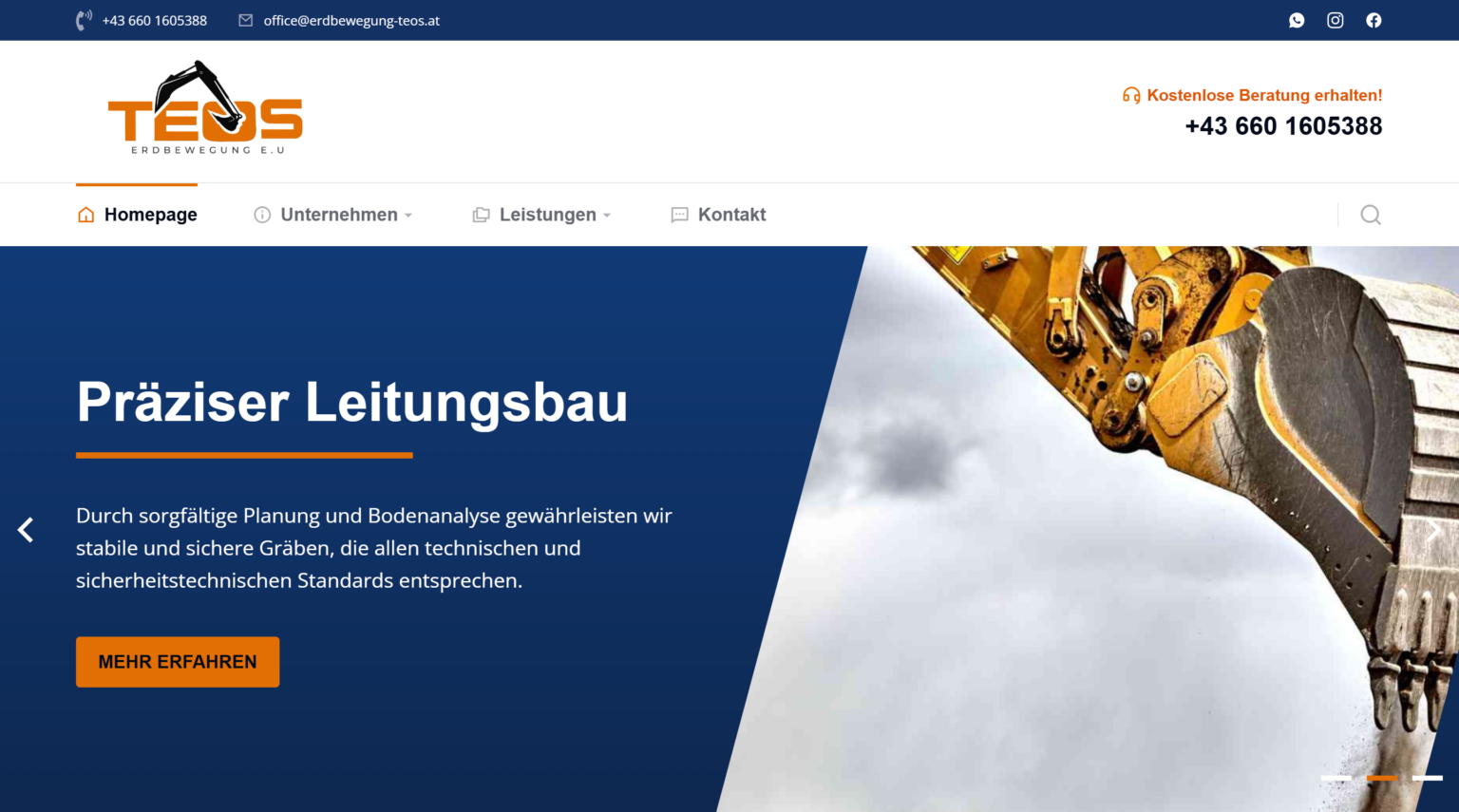
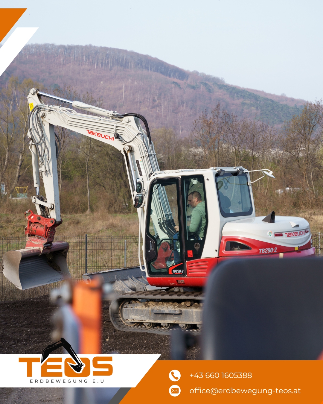
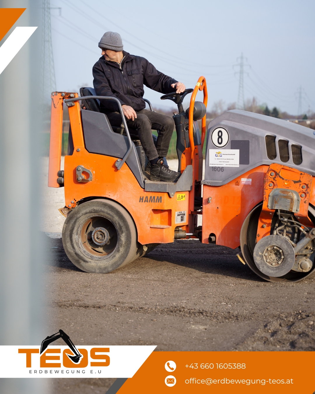
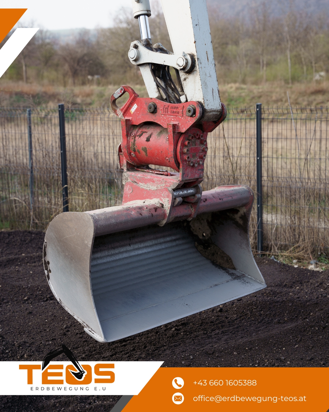
TEOS now shows up like an established contractor: business cards and a clear price list to hand out on-site, a social feed built from the team’s own job-site footage, and noticeably stronger visibility in Vienna local search, all without losing the orange-and-black look customers already knew.